What Makes a Children's Book Illustration Style Work
When you pick up a children's book you loved as a child, the first thing you feel is usually the art. Before you remember the plot, you remember the colour of the world — the particular blue of the sky, the way the characters' faces looked, the feeling the illustrations gave you.
Illustration style in children's books isn't decoration. It's environment. It's the world the story lives in, and it shapes how children experience everything else: the characters, the mood, the emotional register of the story.
Understanding what makes illustration styles work — and what makes them fail — helps you choose books that will actually engage your child, and helps you understand what you're looking at when evaluating personalized AI storybooks.
Why Illustration Style Matters More Than You Think
Children process books differently from adults. Adults read text and let illustrations supplement. Young children, especially pre-readers, do the opposite: they read the illustrations first and the text second (or have it read to them). The images are the primary story.
This means the illustration style isn't just aesthetics — it's communication. A style that feels warm and safe tells the child this story is safe. A style that's energetic and slightly chaotic tells them this story is exciting. A style that's sparse and elegant tells them this story is gentle.
Children read these signals intuitively and accurately. They know, from the first spread, whether this book is for them.
The Elements of Illustration Style in Children's Books
Colour palette
What it communicates: Warm, saturated palettes (reds, oranges, golden yellows) feel comforting and energetic. Cool, desaturated palettes (greys, blues, muted greens) feel quieter and more contemplative. High contrast feels dramatic; low contrast feels gentle.
What to look for: Consistency within a book (a palette that shifts dramatically between spreads breaks the world) and fit with the emotional tone of the story (a scary adventure probably shouldn't be in pastels).
In AI illustration: One of the hardest things to maintain. AI diffusion models tend to drift in palette between generations. Good services apply consistent style constraints across all illustrations.
Character design
What it communicates: Highly stylized characters (exaggerated proportions, simplified features) are more readable and often funnier. More realistic characters feel more serious. The size of the eyes relative to the face communicates emotional availability — big eyes read as emotionally accessible.
What to look for: Expressiveness above realism. Children don't need accurate anatomy; they need characters whose emotions are legible. A character whose happiness is unmistakably visible from across the room is a well-designed character.
In AI illustration: Character consistency is the core challenge in personalized books. The character should look like the same person across all illustrations — same face, same proportions, same distinctive features. See how AI storybooks work for how custom model training solves this.
Line work vs. no line work
Line work (with defined outlines): Creates clarity and a sense of structure. Children tend to find lined characters easier to read and more legible. Slightly more formal feeling.
No line work (painterly): Creates a dreamier, more immersive quality. Watercolour-style illustration typically avoids hard lines. Warmer, more atmospheric.
Mixed approaches: Most successful children's book illustrators find their own version of this — defined enough to be readable, soft enough to feel like a story.
Negative space and composition
What it communicates: How much of the page is "empty" shapes the pacing of the book. Busy, detailed spreads slow the reader down and reward exploration. Sparse spreads feel faster and more urgent.
What to look for: Intentionality. The best children's illustrators use composition to direct attention — the child's eye is led to the character, to the key object, to the emotional center of the scene. Accidental composition (everything is equally weighted) creates visual noise.
Style consistency
The most overlooked element: A book where the illustration style shifts between pages feels wrong to children, even if they can't say why. The world they're in has stopped being consistent, which means it's stopped being real to them.
This is one of the clearest quality signals in AI-generated children's books. Services that apply genuine style constraints produce books that feel like books. Services that use generic prompts produce books that feel like assemblages.
Major Illustration Styles in Children's Books
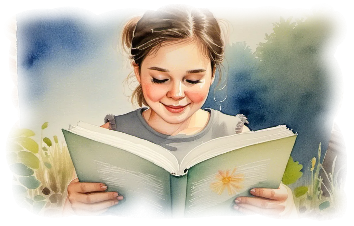
Watercolour
Feels like: Gentle, warm, slightly magical. The most traditional "children's book" aesthetic for many families.
Best for: Stories set in nature, fairy tales, emotional stories about relationships, quiet adventures. Ages 2–8.
Examples: Classic Beatrix Potter, Maurice Sendak's gentler work, many contemporary picture books.
Challenges: Hard to maintain consistency — watercolour involves a lot of soft edges, which makes character recognition harder. Premium AI services apply watercolour style while maintaining character clarity.
Graphic/Bold
Feels like: Modern, energetic, fun. Strong shapes, flat colours, clear outlines.
Best for: Stories with humour, adventure, action. Children who respond to bold visual energy. Ages 3–10.
Examples: Mo Willems (Pigeon books), Oliver Jeffers, many contemporary picture books.
Challenges: Character must be highly stylized; realistic likeness is harder in this style.
Digital Painterly
Feels like: Rich, detailed, immersive. Like a painting but precise. Often used for more epic settings.
Best for: Fantasy adventures, science fiction settings, stories with large, detailed worlds. Ages 5–12.
Examples: Many recent fantasy and adventure picture books and middle-grade illustrated novels.
Pencil/Sketch
Feels like: Hand-made, intimate, slightly rough. Like it was drawn just for you.
Best for: Stories with a personal, diary-like quality. Older children. Ages 7–12.
Retro/Vintage
Feels like: Nostalgic, slightly timeless. Parents often love this style for the childhood memory it evokes.
Best for: Classic fairy tales, family stories across generations, gifts for grandparents as much as children.
What to Look for in a Personalized AI Storybook's Illustrations
If you're evaluating an AI storybook service, here are the questions to ask:
Does the character look like the same person on every page? Inconsistency is the most common failure in AI children's books. The character's face should be recognisably consistent from page 1 to page 40.
Is the style consistent throughout? Not just the character — the palette, the line work, the level of detail should all hold across the book.
Are there obvious AI artifacts? Extra fingers, text that's gibberish within the image, faces that look distorted — these indicate insufficient quality control.
Does the style fit the story's emotional register? A cheerful adventure story in dark, muted tones is a mismatch. A tender family story in harsh graphic style is another. The style should serve the mood.
Does the composition direct attention? In each spread, is it clear where the child should look? Is the main character clearly the focus?
How Storique Approaches Illustration Style
Storique offers 26 illustration styles, developed in collaboration with artists to ensure they're aesthetically coherent — not just technically possible.
Before ordering, you choose a style. The same custom character model (trained from your child's photos) is then used to generate all illustrations in that style — maintaining character consistency across watercolour, digital painterly, graphic, and other options.
The result is a book that has a genuine visual identity — a world the story lives in — rather than a collection of separately generated images.
Browse styles and create your book →
Also in this guide:
- How AI Storybooks Work — how character consistency is achieved
- How to Write a Children's Book Story for Your Child — pairing story with the right visual tone
- Personalized Christmas Gifts for Kids — choosing a style for the holidays
→ Back to The Ultimate Guide to Meaningful, Personalized Gifts
FAQ
What illustration style is best for very young children (under 3)?
Bold, high-contrast styles with large simple shapes and very expressive characters work best for the youngest readers. Complexity is the enemy at this age — the simpler and clearer the image, the more easily they read it. Strong primary colours also hold attention better than muted palettes for under-3s.
Why do some AI-generated books feel "off" visually?
Usually one of three reasons: style inconsistency across pages, obvious AI artifacts (malformed hands, distorted faces), or a mismatch between the style and the story's emotional tone. Premium AI services invest heavily in quality control to avoid all three.
Can I choose an illustration style based on my child's preferences?
Yes — Storique lets you choose from 26 styles before ordering. If your child already has favourite books, look at those illustration styles and match accordingly.
Does illustration style affect how much children engage with the book?
Yes, significantly. Children have strong visual preferences from a young age. A style that matches their aesthetic sensibility means they'll engage more actively with the illustrations — which means they'll experience the story more fully. It's worth taking the style choice seriously.
Can the same illustration style be used for multiple books?
Yes — if you order multiple Storique books featuring the same child, the custom character model can be reused and combined with any of the available styles. Same child, different adventures, different visual worlds.
A little story magic, delivered.
New free stories, thoughtful gift ideas, and occasional Storique news — one lovely email at a time.
- Free stories
- Gift ideas
- Storique news